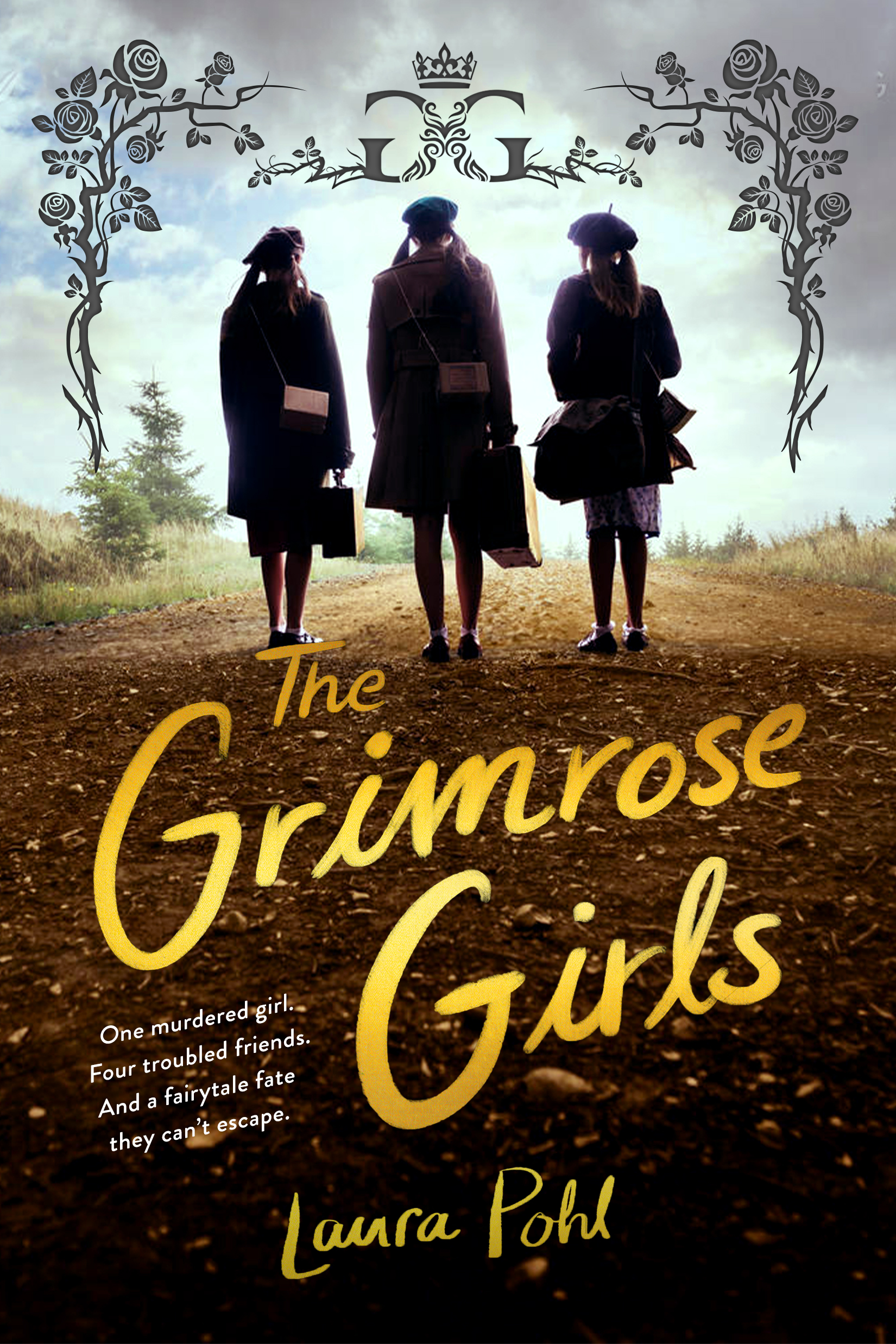
It’s been a while since you’ve heard from me on the blog. I wanted to show everyone some things regarding the cover of my new book, THE GRIMROSE GIRLS, which will come out in November, 2021. Here’s the gorgeous cover if you haven’t seen it!
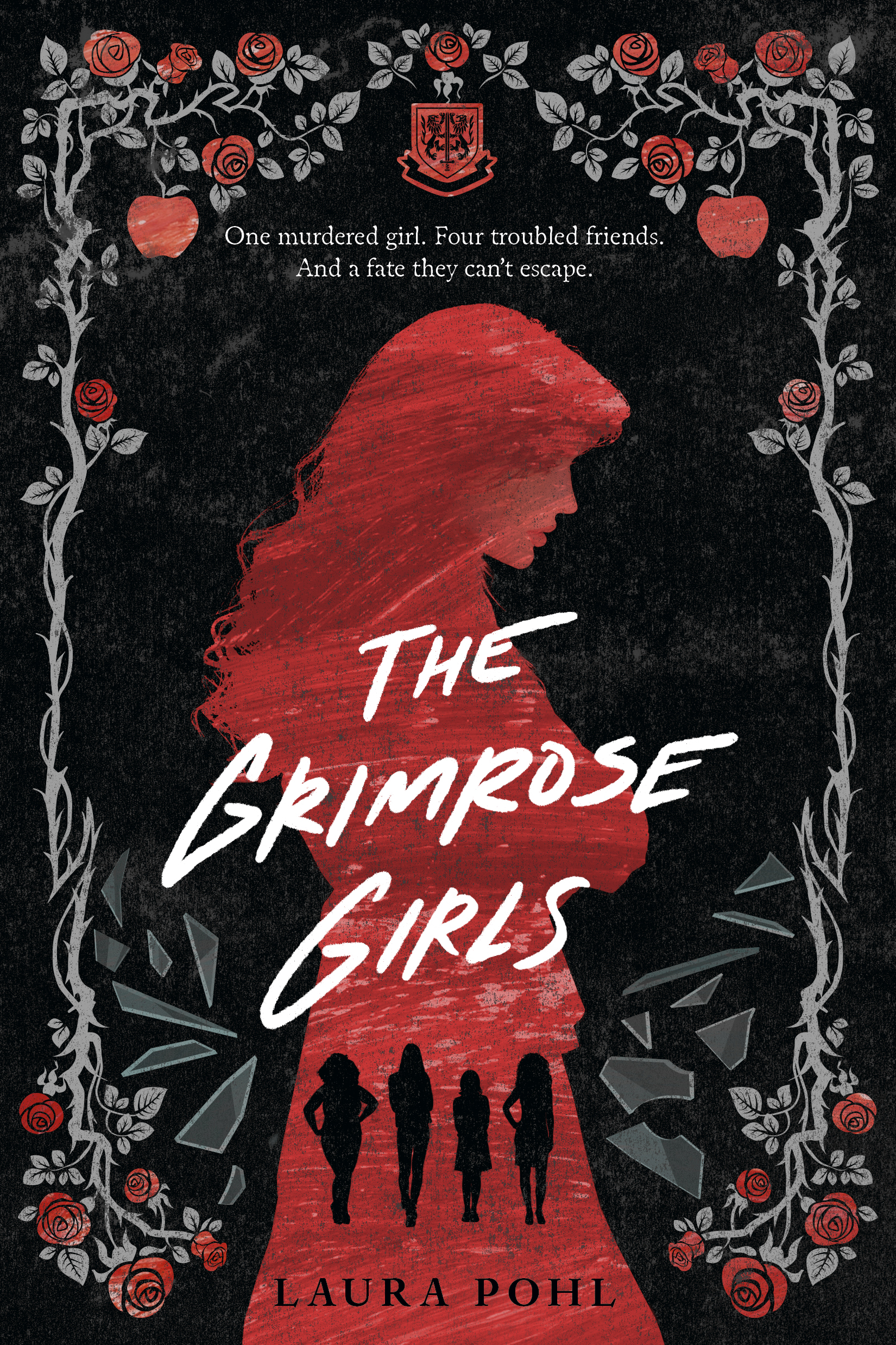
I really love this cover and how well it captures the heart of the story. The Grimrose Girls is a book about four girls in boarding school (pictured in the silhouettes) who start investigating the mysterious death of their friend, and find that they’re all connected to an ancient fairytale curse. It’s got mystery, fairytales, boarding school, and the dark tone of the cover really captures the heart of this blend of thriller and contemporary fantasy.
You may be wondering, however, that I had another book coming out in 2021. You may recall that the original title was A Beautiful Doom. So what happened?
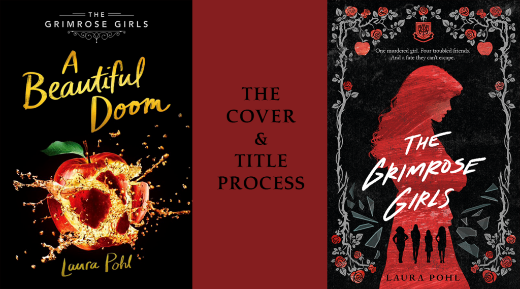
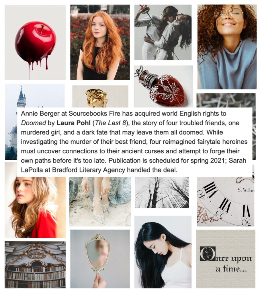
I sold the Grimrose Girls duology at the end of 2019. That means The First 7, my second book, hadn’t even come out yet. Back then, it was known as Doomed.
As you can see, the announcement didn’t even include that it was going to be a duology yet. Sourcebooks and I were working in tandem to make sure the story was in its perfect form, and that meant it was going to be two books! I was really excited, but at the same time, Doomed didn’t leave a lot of room for a sequel title. So we went back to the drawing board.
The First Cover
The challenge of The Grimrose Girls is that it’s a book that’s both contemporary fantasy with heavy thriller elements. It blends the two genres together. There’s magic (real magic!), and there’s also a murder spree and an investigation. We wanted to make sure readers knew what to expect when they saw the cover and the title. My editor, Annie Berger at Sourcebooks, came up with the wonderful series title: The Grimrose Girls.
Still, we didn’t feel like it would stand out on its own to convey the fantasy/thriller for the vibe the design team had in mind for the cover. So after discussing titles (and I mean really discussing them, we went back and forth with over 30 titles for this book!) we arrived at A Beautiful Doom.
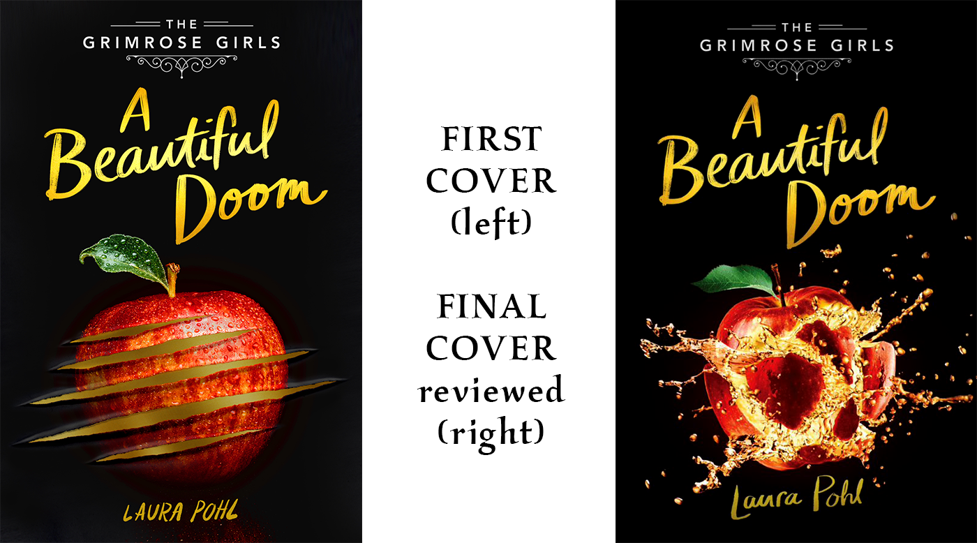
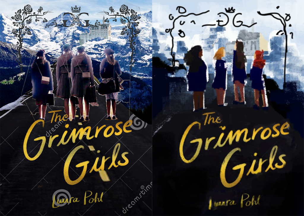
I received the cover on the left first. I really liked the element of the apple (which doubles as a reference to both school and fairytale), and the title of the series is above and creates the atmosphere of fairytales. However, a black cover with apple is deeply reminiscient of Twilight days, and it didn’t stand out on its own enough. The Sourcebooks team tweaked the cover and voilà: you have the cover on the right!
At the time, we felt like this was the perfect cover to settle on. We revealed this cover first in LGBTQ Reads. You can read the first couple of chapters there!
The Second Cover
We were all set, and the book’s release was August 2nd. It had already been pushed back from April, both due from COVID-19 outbreaks and publishing concerns, and because of our title discussions.
After a meeting with everyone on their sales team, Sourcebooks delivered some excellent news to me: the book had even more potential in the catalogue, and they were happy to push it even further! That meant we had to rework the cover, as well as find a new title.
I loved The Grimrose Girls, so I was very happy for it to take center place as not only the start of the series, but the book’s title as well. And the team started discussing a new approach to the cover.
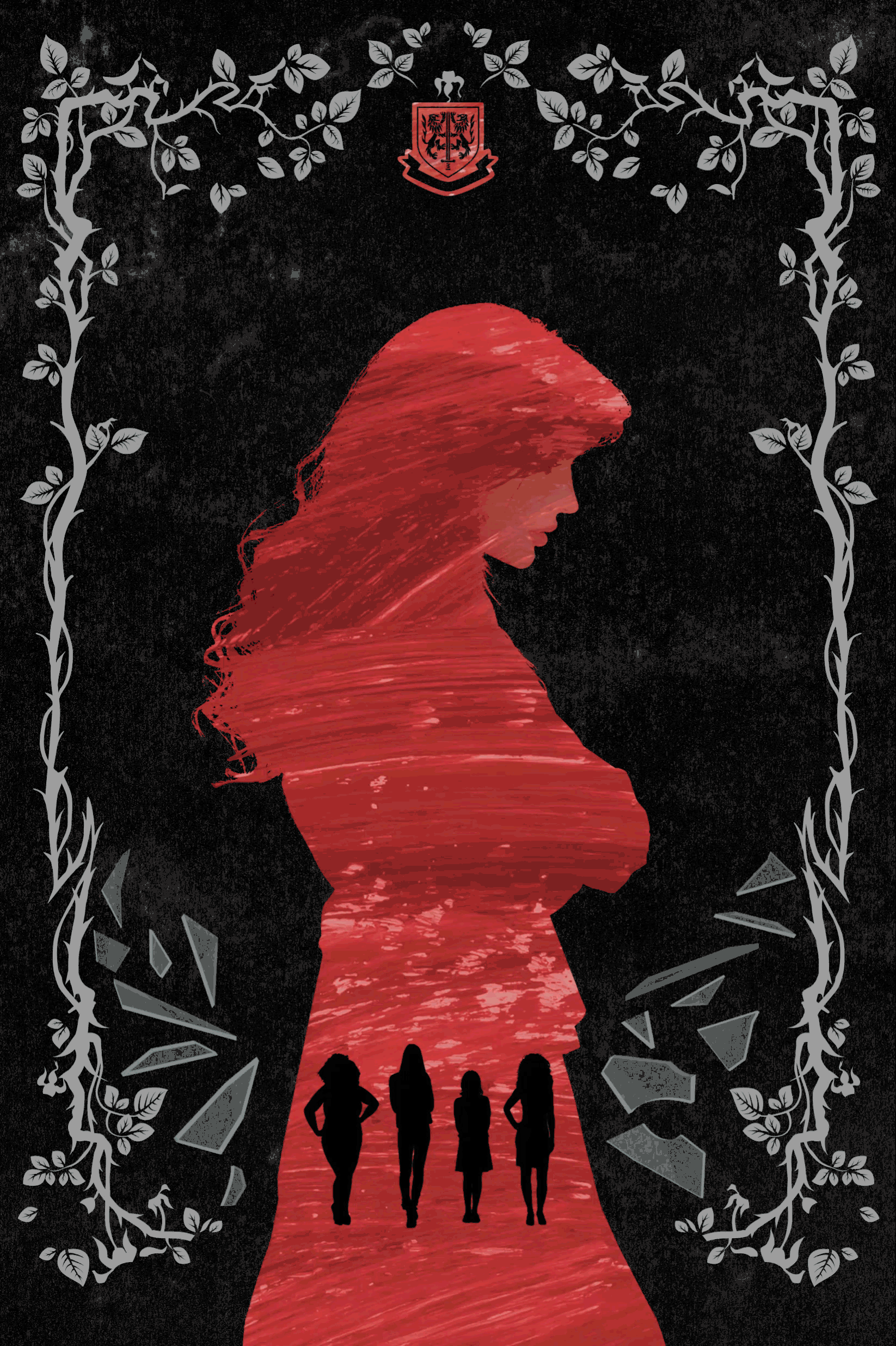
This is a cover for the book that you haven’t seen before!
This was such an interesting take! However, because at its center is a photo, we had limited resources to work with it. Doing photoshop on covers to make the characters look more as they are described in book — the image features 3 white girls, and The Grimrose Girls features 4 main characters, two who are white, another who is both Black and fat, and another who’s Asian — would be a lot more work.
It was important to feature 4 girls on the cover — because they are all equally important as main characters —, and to modernize the road and the uniforms would require heavy photoshop. A photo can be powerful, but it also doesn’t leave room to work with. The more photoshop goes on in a picture to modify it, the more unshapely the results turn out.
Below is a mockup of what the ideal cover would look like, and a sketch drawn yby Samia Harumi, who has done other character art for me. Evidently, we’d have to go for an illustrated cover to remain true to this concept and character descriptions. In the end, we discarded this concept to rework from scratch.
The Final Cover
One of the best things about working with a team of designers is that the process becomes collaborative. Sourcebooks is an exceptionally attentive team who do deep research for all their covers and connects to readers to get their feedback. So when the final cover came back, I was delighted to see that the results are incredible!
The rose stems are reminiscent of the second cover, but everything else is new. You have Ariane, their friend, as the big figure on the cover, and the four main characters below. I love the element of the roses, thorns and the apples. The glass looks interesting and sharp. The title conveys the grittiness of the thriller elements. I really love everything about this new design.
I can’t wait to see the cover in person and in readers’ hands!
As for now, you can preorder through Bookshop, Barnes & Noble, Indiebound, Amazon and Book Depository. You can also add it on Goodreads, and it’s available for reader request on Netgalley. Are you excited to meet the Grimrose Girls?